Saturday, May 2, 2015

Finished Project

The End of an Era


This semester is coming to a close and so is the Book Beautiful class. I have learned so much in such a short amount of time, thanks to Doc Ingersoll. Making a book is a time intensive project, so much so that it literally moves you to tears when it's done.  Before this class, I didn't think that I was this creative, but by being pushed out of my comfort zone, I have discovered I can make books!!
During the semester, we designed and carved our own Ex Libris. We selected each individual piece of our books methodically, then just as methodically learned to cut and sew our materials into a functional book. I made a travel journal so I could record all the adventures I will have abroad in this blank journal. I am beyond proud of how it turned out :) This gave me such respect for professional book binders and artists!!


Saturday, April 4, 2015

German Book Bindings

Cloth Bindings

In the 19th century, cloth case bindings were popular.  In Germany, these case bindings were referred to as German Bradel Binding. The origins of this type of binding is unknown; however, the name comes from a Frenchman who worked in Germany, named Alexis-Pierre Bradel.  
First, the signatures are aligned at the edge of a table and then glued together.  The glue is worked into the crevaces and allowed to dry. If a more rounded backing is desired, a small hammer is used to round it out.  The tapes are frayed and glued down in a fan shape.  The backing is then lined with mull which is an adherent. 
The spine of the book, called the Bradel spine, is made out of a strong, thick paper.  If the spine is rounded, then the paper is wrapped around a dowel to dry. The case of the book, then, has to be prepared. 
The cloth is cut in a larger dimensions than the desired book.  The boards are laid on top of the cloth, separated by a gap for the spine lining.  They are measured out and pasted down on the cloth.  A bonefolder is used to smooth down the cloth over the board in order to prevent wrinkling.  The edges are turned in and glued on the inside of the case.  
To have an embossed finish, like the German eagle on the edition of Mein Kampf that I am studying, an embossing press and itallic gold foil are required.  A brass carving of the German eagle and Nazi swastikas was used to emboss onto the cloth.  
Before the case and the book are put together, the book must be trimmed.  A secondary lining is glued over the spine. The case is then joined with the book.  There is a small video at the end of the blog that shows you how case-binding is done with a machine. 


Works Cited
"About the Binding." : Bradel Binding -part 1 a Paper Case Binding. N.p., n.d. Web. 04 Apr. 2015.
"German Case (Bradel) Binding." - Peter D. Verheyen || The Book Arts Web. N.p., n.d. Web. 04 Apr. 2015.


Saturday, March 7, 2015

Illuminated Mein Kampf

Illustrations:

"Propaganda works on the general public from the standpoint of an idea and makes them ripe for the victory of this idea." --Adolf Hitler, Mein Kampf

From 1936 edition showing a German newspaper
      There are not many illustrations in Mein Kampf.  Many editions contain photos of Adolf Hitler, the war effort, or prominent Nazi leaders.  However, not many have any sort of illustrations.  The 1936 edition of Mein Kampf from Morrow Library had a few examples of Nazi propaganda.  So, I decided to research more about these sketches and about the making and printing of Nazi propaganda at the time.  
From 1936 edition
      In my research, I came across a famous Nazi artist named Hans Schweitzer.  He specialized in posters, illustrations, and caricatures.  He joined the NSDAP in 1926 and began work on creating several propaganda posters for the Nazi party.  He published the illustrations under the pseudonym "Mjölnir." 
Hans Schweitzer Illustration
     Schweitzer published illustrations in several Nazi newspapers, like Völkischer Beocachter.  This newspaper referred to him as "the sketcher par excellence of national-socialism" (Cinamon.) He also illustrated books for Nazi leaders such as Goebbels.  He became an honorary member of the SS, holding prestigious positions over the Chamber of Art.  He was captured in 1947, after fleeing with his family to Schleswig-Holstein.  In 1955, he expunged his Nazi record entirely, and he continued his work as an illustrator.  He opperated under a new name, Herbert Sickinger, and taught painting in Westphalia.  He died in September of 1980 (Cinamon.)
Hans Schweitzer Illustration
  They used a chromolithograph to mass produce the posters, which is a process specifically used for multi-colored works.  Chromolithographs relied on intensive work by the artist, aiming to create a piece of art closely resembling a painting done by hand. In order to create chromolithographs quicker and cheaper, artists relied heavily on black inks and reprinted the colors over top the black. That can be seen in the first Schweitzer illustration.  This was used until, in the 1930s, when offset printing became popular.  Offset-color printing was used in the poster to the right.  The image is "offset" from a rubber plate to a blanket. 


Cinamon, Gerald. "Hans Schweitzer." German Graphic Designers during the Hitler Period:              Biographical and Bibliographical References by Gerald Cinamon. N.p., 2013. Web. 07 Mar. 2015.

"Offset Printing." - Wikipedia, the Free Encyclopedia. N.p., n.d. Web. 07 Mar. 2015.

Wednesday, February 25, 2015

Printing Process in Germany

Heidelberg Press and Germany's Printing Process


       Because I discussed typography a couple blogs ago, I have decided to delve into the printing processes in Germany.  In 1439, Johannes Gutenberg first used movable print.  Gutenberg was a German that facilitated the printing process, using dark oil-based inks.  He is popularly known for his 42-line Gutenberg Bible.  This famous German introduced movable type to all of Europe.  
Heidelberg Press today
           In 1934, the Heidelberg Press revolutionized printing, and continues to do so now.  The Heidelberg Press was a fully automatic cylinder press. During WWII, the Heidelberg Press actually kept its distance from the NSDAP.  When the Allies marched into Heidelberg, the soldiers neither occupied the factory or dismantled it! There was a small halt to production, but it resumed before the official end of the war.  According to the company's website, there are 400,000 Heidelberg presses in 240,000 companies worldwide ("the Heidelberg.") 
        The German Heidelberg Press has expanded and adapted with the times. Today, not only is it a leading company in earnings but also one in developing new technologies.  It has developed a CO2 neutral machine that reduced the output of carbon dioxide. The company has championed a movement to greener technology (CO2 Neutral Machines.)

        As I discussed a couple of weeks ago, German typography was not exactly unique to Germany, using the Gothic Fraktur type.  However, during the 20s and 30s, Germany kept utilizing this type where other countries moved on.  
       Rudolf Koch had a private workshop in Germany and worked as a teacher and typographer after WWI.  He designed the Wallau type in the 30s, which was his personal version of Rotunda.  Koch had Eichenauer as a punch-cutter during this time as well.  I included a small video on punch-cutting which shows how the metal is cut, etc.  
   In 1919, the Weimar Republic founded the Bauhaus which taught the craft of typography.  A famous typographer Marcel Breuer was employed here.  This organization tried to test the restrictions on color and form of the type, but failed later (1933) due to the impracticality of their works (Chappell 204-227.)
    During the war, several typographers, including some of Koch's co-workers, fled Germany due to rising fascism.  When the Nazi's rose to power, they took over the presses and consolidated individual presses into one state-run industry.  This was done to limit freedom of press, protecting the Nazi rule.  

Until Next Week!
Alexis S.
    

 Citations:

Chappell, Warren. A Short History of the Printed Word. New York: Knopf, 1970. Print.
"CO₂ Neutral Machines". Heidelberg Druckmaschinen AG, n.d. Web. 25 Feb. 2015.
"The Heidelberg." Corrdigital. N.p., 17 Mar. 2013. Web. 24 Feb. 2015.

Monday, February 23, 2015

History of Paper in Germany

German Paper

        The paper making process began in China as early as 105 A.D. The process made it to Germany in about 1320.  In 1844, Friedrich Keller invented an industrialized process of paper making from wood pulp. Keller sold his discovery to a paper specialist, Heinrich Voelter.  In 1948, Voelter worked with Johann Voith to mass produce paper via this method.  Voith created the Raffineur that refined the paper further, improving the quality of the paper.  Their company still exists today as a part of the Industrial company Voith AG ("Friedrich Keller...").
      In 1879, Carl F. Dahl created the Kraft process for making paper in Danzig, Prussia. This process elicited a stronger, less permanent paper by using sulfate.  The recovery boiler, invented by Tomlinson, increased the efficiency of the Kraft process in the 1930s ("Carl F. Dahl...").
          During the 1930s, the time in which the copy of Mein Kampf from Morrow was written, Germany was suffering heavily economically.  The Great Depression hit them hard, causing high inflation and food shortages.  They had to ration their food and worked to develop synthetics.  The economic system recovered from the devastation of WWI, however, through several work programs ran by the Nazi government.  I am unaware of any paper shortages during the war.  Most luxury items still were rationed, but Newspapers and propaganda papers were widespread at this time. After the war, Germany had several fliers asking them to save and recycle papers (seen below.)


"Friedrich Keller Rediscovers Paper Making from Wood Pulp & Industrializes the Process (October 26,        1844 – August 1845)." : HistoryofInformation.com. Jeremy Norman & Co., Inc., 2015. Web. 23 Feb.      2015.

"Carl F. Dahl | Biography - German Inventor." Encyclopedia Britannica Online. Encyclopedia Britannica,       n.d. Web. 23 Feb. 2015.

Saturday, February 14, 2015

German Type

      German's were possessive about their German typography.  Some promonent Germans, such as German diplomat Otto Von Bismarck, refused to read anything not printed in German type.  Germans began using Fraktur,what they call their German Gothic type, in the fifteenth century and continued to use it until after WWII.  The type was called Fraktur in reference to how the letters are cut into sharp angles rather than flowing script. They also referred to it as Deutche Schriften, or German Black Letter Type.  Although other countries used this type, German speaking countries were the only ones to use it as long as it did.  The edition of Mein Kampf that I am studying was printed in Fraktur.  
An example of Fraktur typography
  The first German newspaper was printed in Fraktur.  Despite Germans clinging to the idea of this specific type for most documents, Adolf Hitler strongly discouraged its use. At first, he declared it to be a symbol of nationalistic pride, but he changed his mind later, declaring it unfit for such a strong empire.  He moved to change the type to a roman type in the 40s, mirroring the success of the Roman Empire.  I found an edition of Mein Kampf from 1943 set in Antigua type that shows the change in German thinking.  Most money, stamps, and books were printed in Fraktur before this time.
    This type has become associated with the Nazis, given the nickname "Nazi Type," despite it being around and used by Germans by far longer than the life of the Nazi Party of the Third Reich. The NSDAP, or Nazi Party, most commonly used Zenetenar Fraktur.
1943 Mein Kampf printed in Antigua
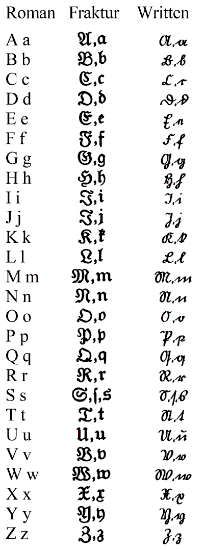
The difference between Roman and Fraktur
      As you can see, this script is difficult to read, even if you can read German! I tried to read sections of this book only to struggle over which letter is which.  I found this chart online that is helpful in deciphering some of the letters. Honestly, this made trying to read the publisher and dates very difficult!
    In Nazi Germany, the NSDAP heavily censored everything in the printing world.  They controlled all printing processes in the country at that time. The Germans perfected typesetting, the arrangement of letters on a plate, and ligature, the shape of the letters as dependent on surrounding letters.  If they wanted bold type, they had to recreate a plate especially for that. They used a movable type press where the ink was more evenly dispersed. They still had to change out plates. The Gutenberg press facilitated this process, using plates made of metal like tin.
 

Tuesday, February 3, 2015

Ex Libris and Provenance

     Mein Kampf possesses an interesting personality because of the many different types of people who have owned it as well as the time period in which they owned it.  I found several unique and amazing bookplates and provenance by studying different editions of Mein Kampf online as well as looking through the 1936 edition that Morrow Library has.  
Piece of Newspaper Back
     The Mein Kampf from Morrow has an intriguing piece of provenance tucked within its pages.  Hidden within the pages, there was a small piece of German newspaper. This newspaper was printed in Germany and has a Neumann advertisement.  Under the Neumann name, there is a description of the store in German. After loosely translating it to the best of my ability, it appears to be a shoe store. Someone wrote on the reverse side several numbers that look like troop numbers.  They included the S.S., France, and Italy. 
Piece of Newspaper Front
   
 In October of 2014, an edition of Mein Kampf went for sale that has amazing examples of provenance and ex libris.  The edition which sold for almost $30,000 contained Hitler's personal bookplate. This book plate has the German eagle, proudly perched over the Nazi emblem. Two other men inscribed their name inside this book: Wardly and Dr. Wagner.  Wardly identified himself as a veteran from the 70th Field Security Section.  Dr. Gerhard Wagner was a chief physician of the Reich. Hitler was a known hypochondriac, so it makes sense that Wagner would have spent a lot of time with the Fuhrer. This book has a rich background from print to being lost to being found again. This website includes a more detailed look at this particular Mein Kampf.
    https://dl.dropboxusercontent.com/u/80787177/lieber.pdf


Goering's bookplate and Laurant's writing.  
While researching Mein Kampf I came upon a couple of other examples of amazing provenance and ex libris. This edition of Mein Kampf, printed in 1941, holds another bookplate from a prominent member of the Nazi party, Hermann Goering. Goering was the Reichsmarshall in charge of both the Gestapo and the renowned Luftwaffe. He was very close to Adolf Hitler, becoming one of the Fuhrer's closest friends.  The provenance on the right side of the page is interesting, because the Frenchman that liberated the book, Rene Laurent, who made his mark after retrieving it.  The officer was in the 2nd Armed Division under General Leclerc, who is famous for the liberation of Paris. Goering's bookplate is rare, bearing the image of St. George and the dragon, alongside other German mottos. For more information of Goering, I included a documentary video below. 


Until Next Week!
Alexis Smith


Saturday, January 31, 2015

Origami Books

Unusual Origami Books


      This week, I am taking a break from discussing the design of Mein Kampf and writting about unique books. Helen Friel designed this unusual edition of Edgar Allen Poe's the "the Imp of the Perverse." In order to read this copy, the reader has to tear and fold the book, following instructions included.  Friel says that she designed it in this way to challenge the traditional feelings surrounding books, that they need to be unwritten in and preserved. She claims that she wants the reader to find within him or her an Imp, mischievously ripping and tearing.
     Friel is a "paper engineer" and challenges herself to come up with unique ways to deal with paper.  The origami book is one of my favorite book designs, forcing the reader to become involved in the story. They become the Imp, working fervently to discover the progression of the plot.  I would love to own a copy!

                                                                         Until Next Week!
 Alexis Smith

Saturday, January 24, 2015

Book Personality

Book Personality


     For this class, I decided to study the 1936 copy of Mein Kampf from our special collections in Morrow Library. The first question you will have is "why Mein Kampf?" This may be fueled by outrage, and I understand why. This book carries with it many emotions, each edition, each copy has its own feelings attached to it. Now, it is taboo to call this book beautiful due to the feelings of devastation and fear that still permeates our minds from WWII. After all, we aren't very far removed from the atrocities that stole millions of lives. Today, Germany has laws against the publication and sale of Mein Kampf, and many other countries strongly condemn any publisher that decides to print copies.  
     But this book has character because of all the feelings surrounding it.  Copies from the peak of Nazi power were elaborate, signed, loved. They were bound with unique book plates and carry marks of history on their pages.  Each copy has a German print, a unique topography.  I am excited to research how Morrow came into its copy and explore the beauty of each copy of a book surrounded in fear, mystery, and taboo.  
      Mein Kampf was originally published on July 18, 1925 in two volumes; it was written by Adolf Hitler during his time in prison. At the height of Nazi popularity, thousands of copies were printed, personalized, and signed. Most people, due to the culture, were in some way actively involved in the party.  By 1936, over 5 million copies were printed, and it was translated into 11 different languages (Encyclopedia Britannica.)   Max Amann first published the book on Nazi Party presses (History Learning Cite.)            


 Signature in the 1936 copy from Morrow.

       The first thing that I noticed about this particular copy from Morrow was the signature which looks like the signature of Adolf Hitler himself underneath his photo.  I am very excited to be able to dig deeper into this book, how it was put together, how Morrow got it, what makes this and the other copies beautiful.

      Until Next Week!
      Alexis Smith                               


"Max Amann". HistoryLearningSite.co.uk. 2014. Web."Mein Kampf". Encyclopædia Britannica. Encyclopædia Britannica Online.Encyclopædia Britannica Inc., 2015. Web. 24 Jan. 2015<http://www.britannica.com/EBchecked/topic/373362/Mein-Kampf>.

Thursday, January 15, 2015

Hello!


     My name is Alexis Smith. I am a Junior at Marshall University. I am writing this blog about my journey through my honors class "The Book Beautiful." At Marshall University, I am very lucky to be able to study my two passions, language and International Affairs. 
     As an assistant librarian and a lover of books, I will learn the small components of a book that make it a thing of beauty in and of itself, from its pages to the type of binding used. As a linguist, I am passionate about the words on the pages. This class will help me see that the book can be judged more deeply than just the words printed upon its pages! I am very excited and nervous for this journey into uncharted territory! 
"The journey of a thousand miles begins with one step" --Lau Tzu 

 Thanks for Reading,  

 Alexis Smith